Index

Vanto Brand

Vanto Co · Brand · 2022

Vanto Brand

Most high-end eyewear brands look the same. Heavy logos, Italian heritage cues, polished surfaces. Premium is communicated through refinement — thick brand language that signals quality by association.

We didn't want any of that.

New York, Unfiltered

Vanto started with a specific feeling: the real New York. Not the tourist version. The gritty, unpolished, unapologetic one. That became the foundation — a brand built on attitude rather than tradition, where premium comes from conviction, not from mimicking what luxury is supposed to look like.

The typography, color, and visual language all followed from there. Every decision was filtered through the same question: does this feel like the city we actually live in?
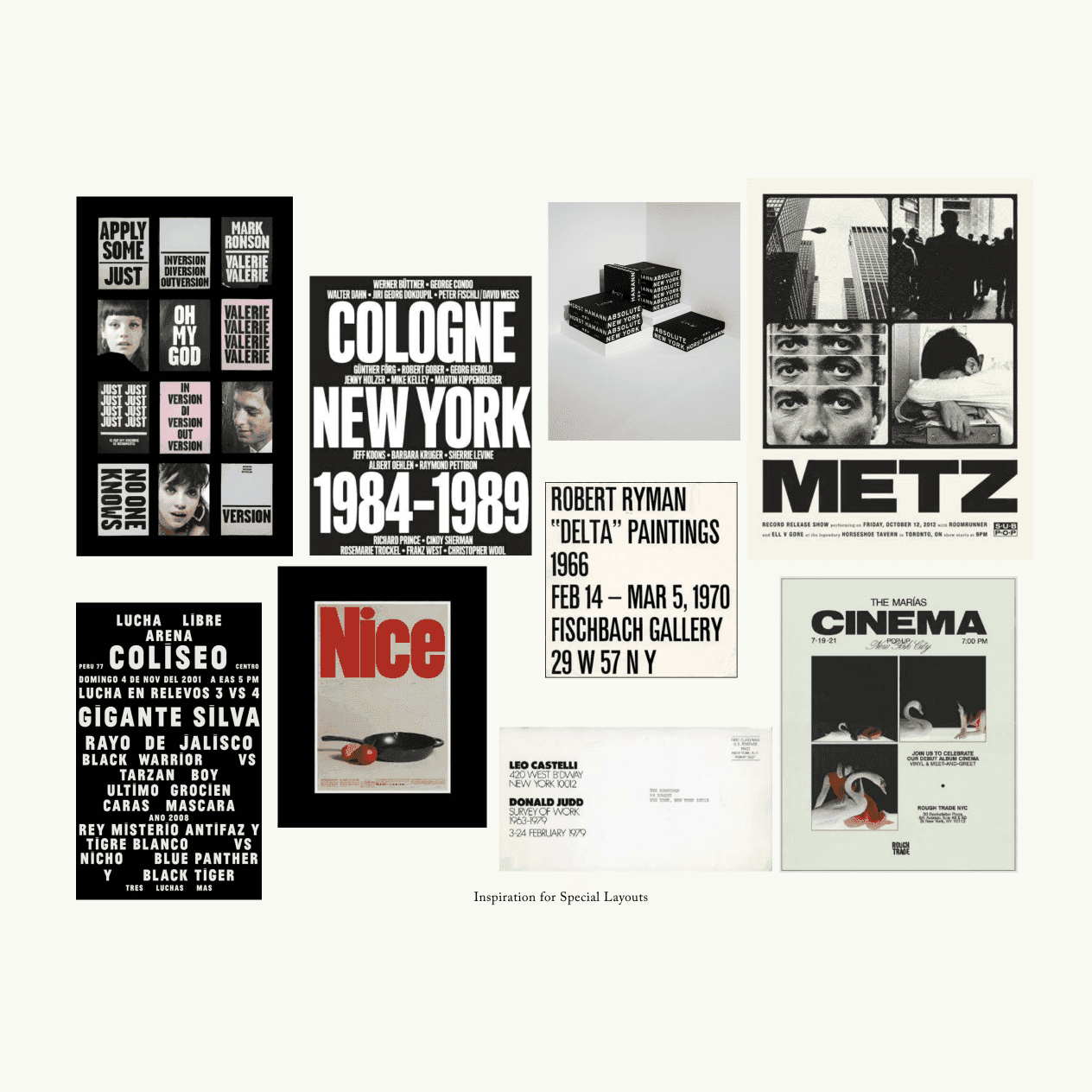
Collage of seven typographic reference posters including Cologne–New York 1984–1989, Robert Ryman gallery announcement, Metz exhibition, and Cinema bills
Inspiration for special layouts
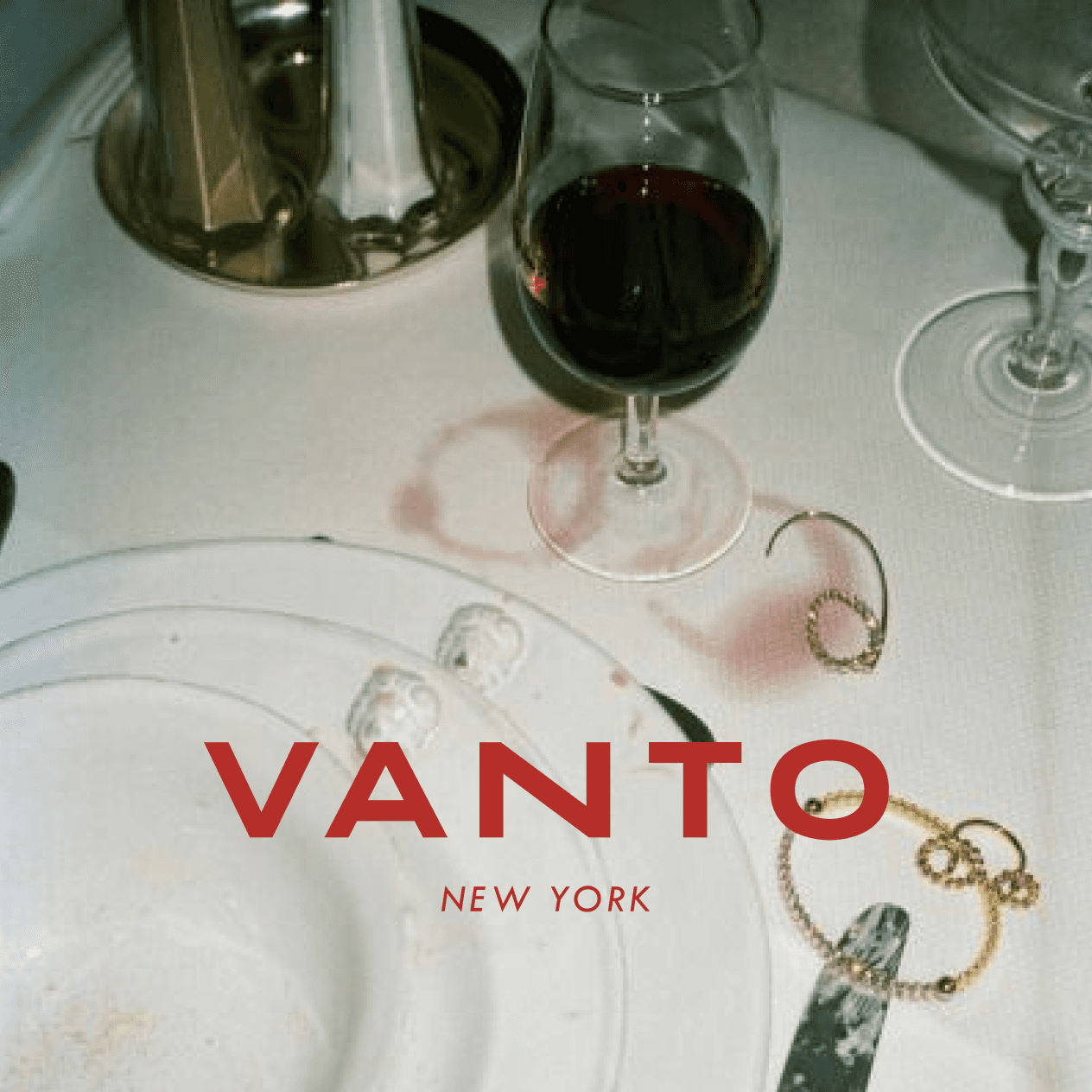
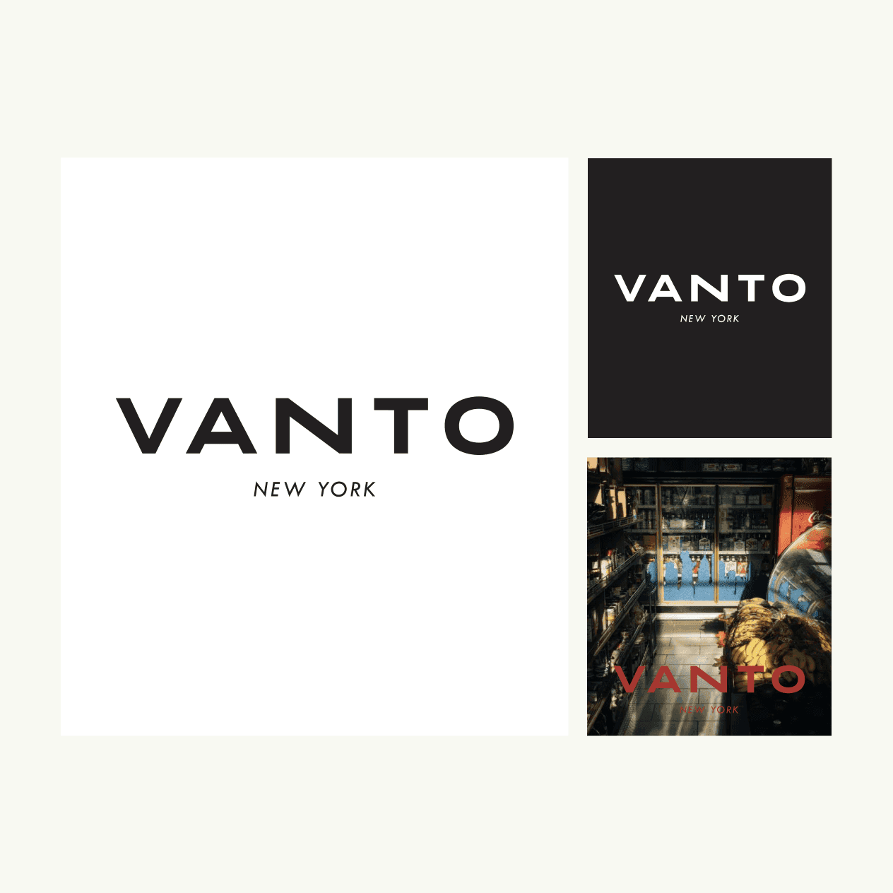
VANTO NEW YORK wordmark in three applications: large white on black, large black on white, and overlaid in red on a gritty NYC bodega photograph
The VANTO NEW YORK wordmark — clean enough to stand on its own, bold enough to hold a wall

Brand and Product Together

The brand identity and the frames developed alongside each other. Neither led — they pushed each other. The rawness of the brand informed how the product felt, and the physicality of the frames pulled the brand into something more grounded than a mood board could produce on its own.

That's how the two halves stayed honest to the same idea.
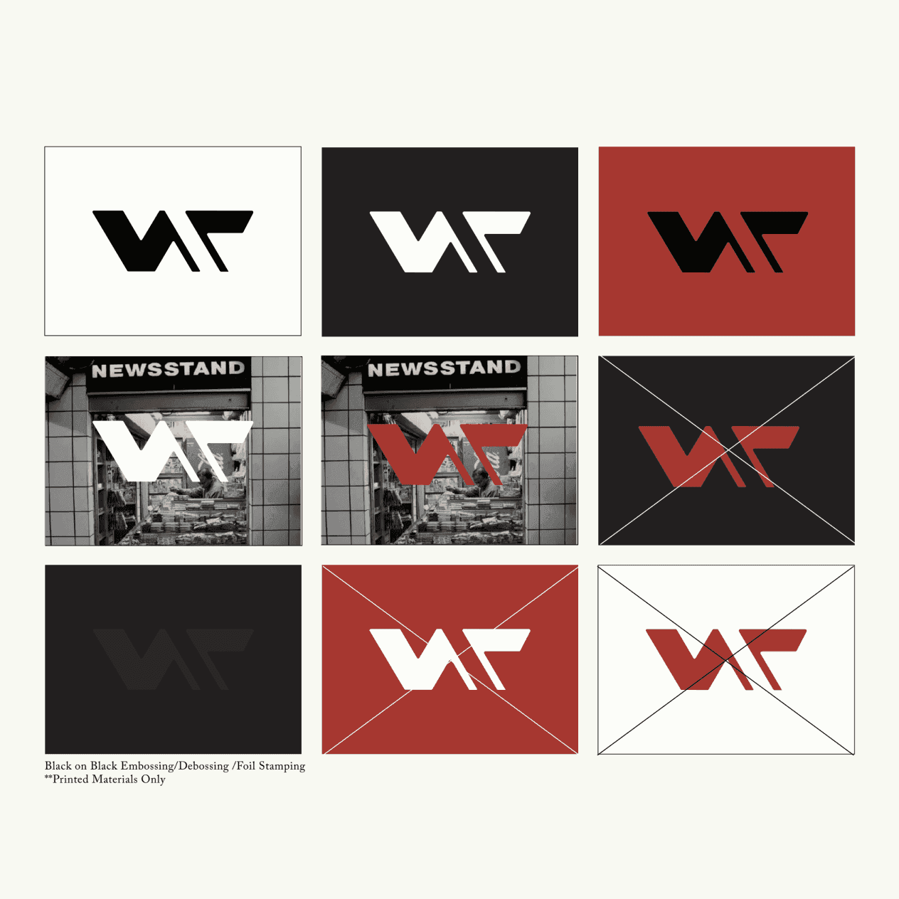
3×3 grid showing the angular V monogram logo on white, black, and red backgrounds, including two newsstand photo overlays and diagonal cross usage rules; note reads Black on Black Embossing/Debossing/Foil Stamping for Printed Materials Only
Logo system across colorways, with embossing and foil stamping specs for print
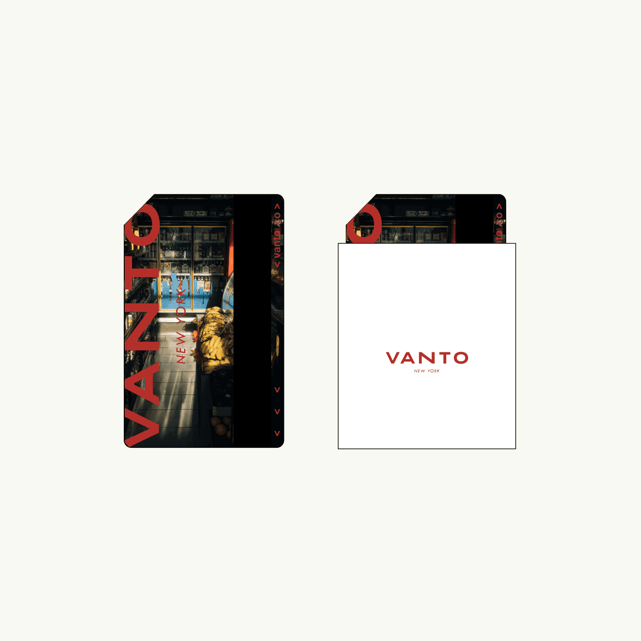
Two rounded-rectangle packaging cards side by side: the front shows a dark bodega photo with large red VANTO NEW YORK type; the back shows a clean white card with the VANTO NEW YORK wordmark in red
Packaging — the newsstand imagery carries the same NYC energy into the unboxing
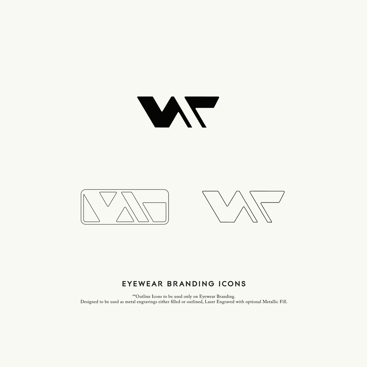
Three Vanto eyewear branding icons on cream background: a filled angular V monogram, a rectangular outline badge version for frame temples, and a standalone outline monogram; labeled EYEWEAR BRANDING ICONS with laser engraving spec note
Eyewear branding icons — designed for metal engraving on the frames themselves

72°F in NYC