Index

Heywear Brand

Heywear · Brand · 2019

Heywear Brand

Eyewear branding defaults to two modes: clinical or luxury. White coats and eye charts, or polished surfaces and European heritage. Both keep people at a distance.

Heywear needed to do the opposite. The whole model was built on accessibility — fast, affordable, no gatekeeping. The brand had to feel that way too.
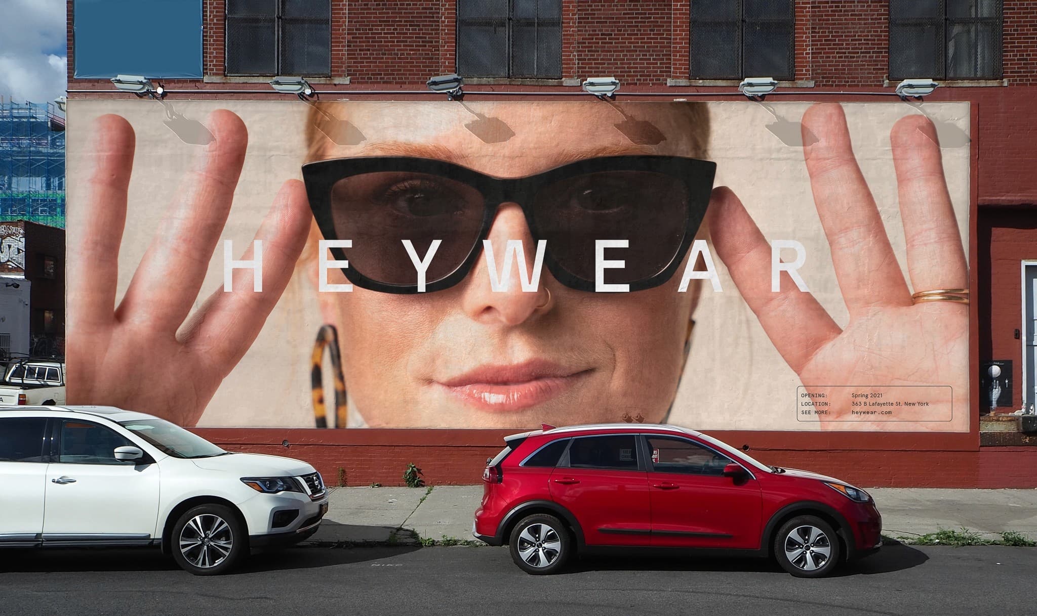
Large building-side billboard showing a close-up face wearing black sunglasses with 'HEYWEAR' set in wide-spaced type across the nose
Street billboard
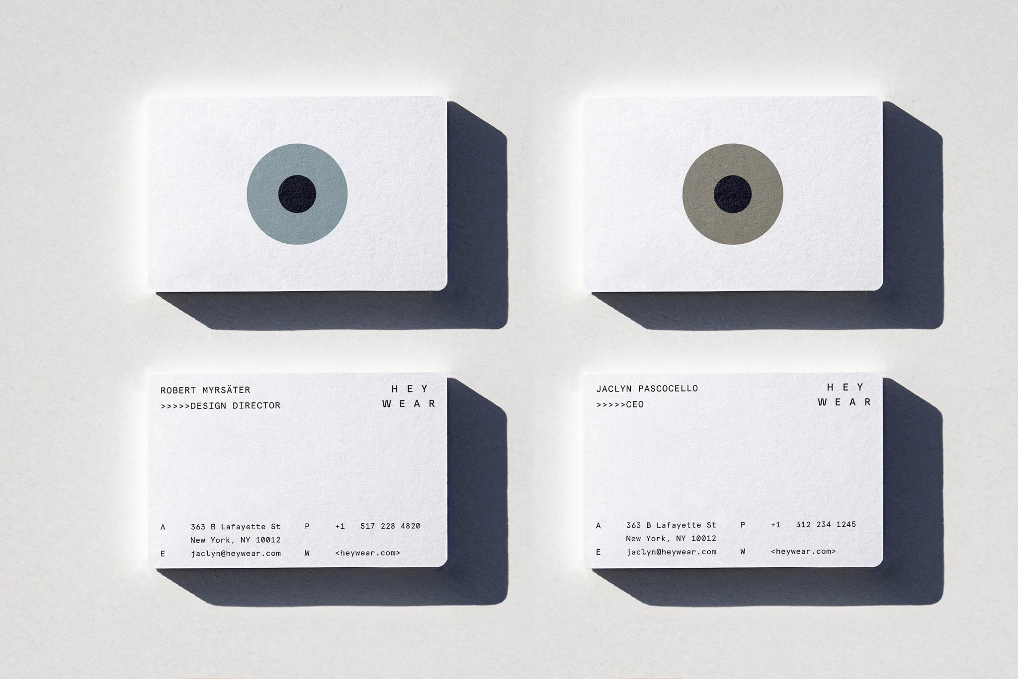
Four Heywear business cards on a white surface: two fronts showing circular lens motifs in blue-grey and olive, two backs with contact details for Robert Myrsäter and Jaclyn Pascocello
Business cards with lens motif

Type, Photography, Tone

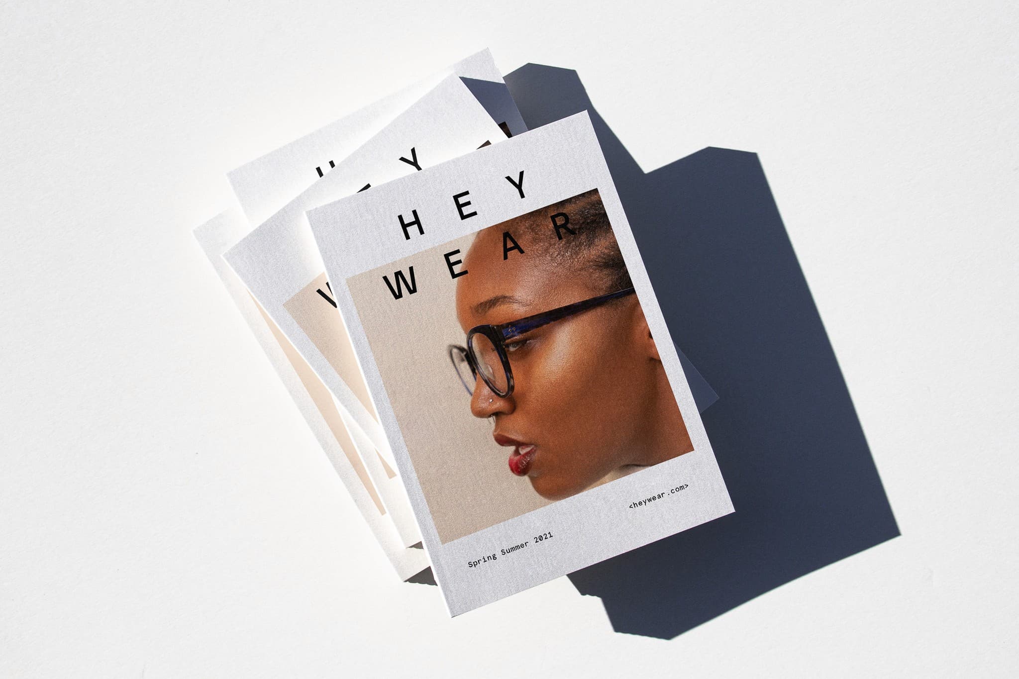
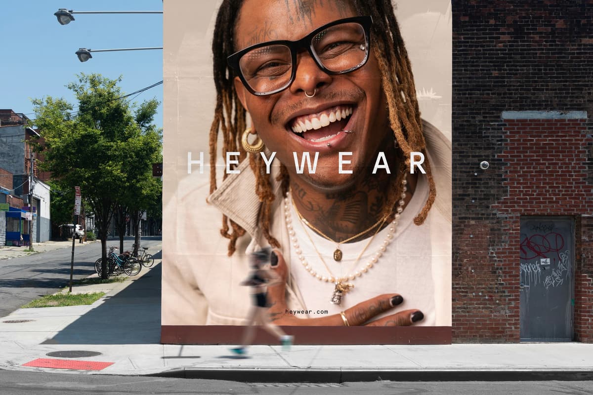
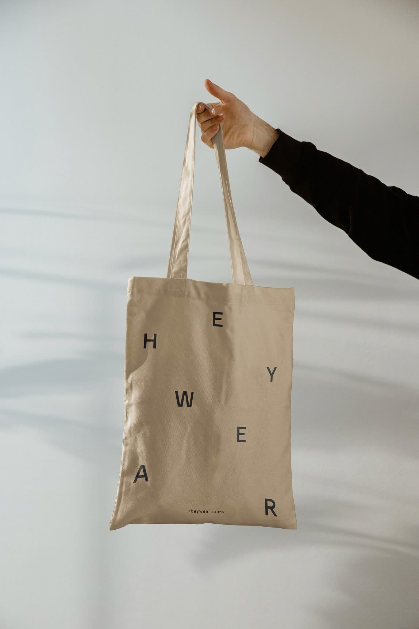
No single element made the brand work. It was the system — scattered typography that felt energetic instead of precious, photography that put real faces at massive scale, and a tone that treated eyewear as something to feel good about, not something to endure.

Every piece reinforced the same idea: this is approachable. The storefront, the billboards, the tote bag, the lookbook — they all speak the same way. Not minimal and serious. Not loud and cheap. Just direct, warm, and confident.
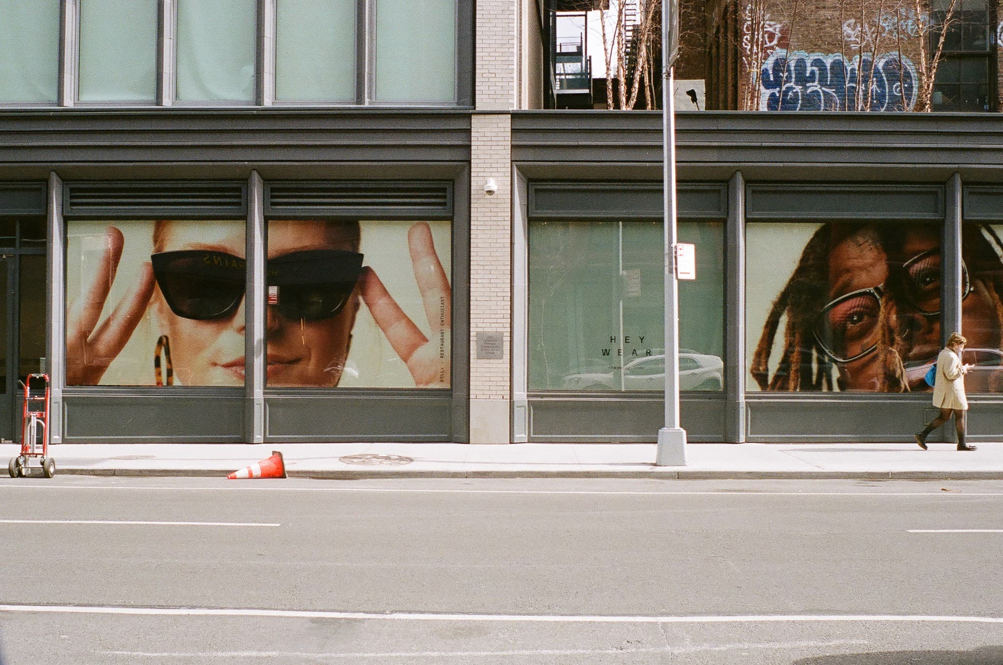
Heywear Lafayette Street storefront shot from across the road, large window graphics showing close-up faces wearing glasses
Flagship storefront, Lafayette Street
Hand holding up a natural canvas tote bag printed with scattered individual letters spelling HEYWEAR and the URL heywear.com
Tote bag
Stack of three Heywear Spring Summer 2021 lookbook zines, top cover showing a side-profile portrait of a person wearing round glasses
Spring Summer lookbook

72°F in NYC